
Part of the Blank Canvas series — Day 3 of 7.
Moving into a new house can be surprisingly overwhelming. You know where the front door is. You eventually find the kitchen, but for the first week, you're still opening random cupboards looking for mugs.
A website editor feels much the same.
The first time you open it, you're greeted by buttons, icons, side panels and menus that all seem incredibly important.
Your first instinct?
Click things carefully and hope nothing catches fire. The good news is that you don't need to learn every button today. Additionally, nothing you click in your website builder will start a fire.
In fact, you only need to know three places to become surprisingly productive when you first customize your website. Everything else can wait until you've settled in. That includes things like built in marketing tools and social media links.
Key Takeaways: How to Use a Website Editor
- A website editor lets you add, remove, and customise website content without needing to write code.
- Beginners don't need to learn every feature immediately. Start with the Content Panel, Style Settings, and Mobile Preview.
- Use the Content Panel to add elements such as text, images, galleries, buttons, and contact forms to your pages.
- Style Settings let you control fonts, colours, buttons, and other design choices across your website, helping you maintain a consistent look.
- Check Mobile Preview regularly while building. A page that looks good on desktop may need adjustments for smaller screens.
- Saving and publishing are different. Saving keeps your changes in the editor, while publishing makes those changes visible on your live website.
- The easiest way to learn a website editor is by using it. Make a small change, preview it, publish it, and check the live result before moving on.
Your Week 1 Roadmap: Blank Canvas to Launch-Ready
This is the third post in a seven-part series. Our aim is to take you from “I don’t know where to start” to a finished, working, simple website or online store. And we do it in one honest, practical step at a time:
- Getting Past the Blank Screen
- Choosing Your One Homepage Goal
- Finding Your Way Around the Editor (this post)
- Writing a Headline People Actually Read
- Ready-Made Sections vs Building Your Own
- Picking Colours Without Overthinking It
- Choosing Fonts People Can Actually Read
The Three Places You'll Use The Most
Think of these as the rooms you'll visit every single day.
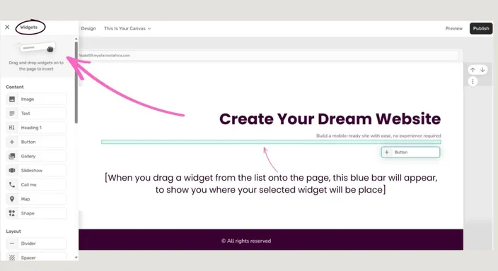
1. The Content Panel
(Top Bar → Add Content → Add Widget)
This is where your website comes to life.
- Need a text block? Grab one.
- Want an image gallery? Drag it onto the page.
- Need a contact form? Same idea.
Think of the Content Panel as your drag and drop editor toolbox.
Every time you want to add something new to your website, this is where you'll find it.
2. Style Settings
This might quietly become your favourite feature.
Instead of changing fonts, colours and buttons one page at a time, Style Settings let you update your entire website in one place.
Change your primary colour once. Every button updates.
Choose your heading font once. Every heading follows suit.
It's one of the biggest time-savers in the editor, yet many beginners don't discover it until they've already updated thirty different pages manually. It makes using website templates, and website design in general, much simpler.
Pro Tip: If you already have a brand guide or logo colours, add them here before you start building. Your entire website will match your brand and will feel far more consistent from day one.
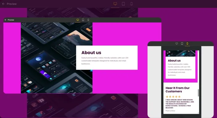
3. Mobile Preview
(Top-right, beside Publish.)
Here's something many beginners don't realise: most of your visitors won't see your website the way you're building it.
They'll see it on a phone. That's why Mobile Preview is one of the most important buttons in the editor. Get into the habit of checking your site is mobile friendly every time you make changes to ensure .
Not after you've finished. Not tomorrow. Every single time.
It only takes a few seconds and can save you from publishing overlapping text, oversized images or buttons that mysteriously disappear off the screen.
Two Mistakes Almost Everyone Makes
Don't worry. These aren't unique to you. Almost every new website owner makes them. Whether they're using a free website builder or connecting a custom domain to an existing website builder.
Mistake 1: Only Looking At The Desktop Version
Your homepage might look beautiful on a large monitor.
Then you open it on your phone and suddenly everything looks like it was packed into a suitcase that's two sizes too small. Not mobile friendly, to say the least.
The fix is wonderfully simple. Every time you change something, switch to Mobile Preview before moving on. Five seconds now can save a lot of embarrassment later.
As a general principle, making your online store or website user friendly is non-negotiable. Regardless whether you're creating a website for mostly desktop or mobile.
Mistake 2: Forgetting To Publish
This one catches everyone. You spend an hour using AI-powered tools and improving your website. You close your browser feeling proud of yourself.
Later you visit your website... Nothing has changed.
Cue confusion.
Remember: Saving stores your work. Publishing shares it with the world. If your updates aren't appearing online, this is almost always the culprit.
A Five-Minute Practice Run
Before building your real website, spend five minutes getting comfortable.
Try this:
- Drag a text box onto your homepage.
- Change your main button colour in Style Settings.
- Switch to Mobile Preview.
- Click Publish.
- Open your website in a new browser tab and make sure your changes appear.
Congratulations. You've just completed the same workflow you'll use every time you update your website.
Our website builder includes a wide range of tools, but sticking with these practice run steps will simplify your life.
What's The Most Important Part Of A Website Editor?
For most beginners, the three most important parts of a website editor are the Content Panel, Style Settings, and Mobile Preview. The Content Panel lets you add new elements like text, images and forms. Style Settings apply fonts and colours across your entire website, saving time and keeping your branding consistent. Mobile Preview shows how your website looks on phones, helping you catch layout issues before visitors do.
If you're looking for a high quality website builder with web hosting, choosing one that combines these tools in a single platform makes building and managing your website much simpler.
Frequently Asked Questions
Why does my website look different on my phone?
Desktop and mobile screens have very different dimensions, so website content may rearrange itself to fit smaller displays.
Large images, long headings, buttons, and multi-column sections can all look different on mobile. Use Mobile Preview regularly while editing rather than waiting until your entire website is finished.
Before publishing, also open the website on a real phone and check that your text is readable, images display correctly, and important buttons are easy to tap.
Do I need to learn every website editor feature before I start building?
No. Trying to learn every feature before creating your first page will probably make the editor feel more complicated than it actually is.
Start with the tools you'll use most frequently: adding content, changing your site's appearance, checking mobile layouts, and publishing updates.
Once you're comfortable with that basic workflow, you can gradually explore additional features when you actually need them.
What happens if I forget to publish my website changes?
Your work can be saved in the editor without appearing on your live website.
That's because saving and publishing serve different purposes. Saving keeps your latest work available for you to continue editing, while publishing pushes those changes to the version visitors can see.
If you've made an update but can't see it on your live website, checking whether you've published is a good first troubleshooting step.
What's the difference between a website builder and a website editor?
A website builder is generally the overall platform you use to create and manage your website. The website editor is the part of that platform where you actually change pages, text, images, layouts, and other elements.
Think of the website builder as your entire workshop and the editor as your workbench.
For beginners, choosing a builder with a straightforward drag-and-drop editor can make creating and maintaining a website much easier.
Can I edit my website after I publish it?
Yes. Publishing your website doesn't mean you've permanently locked everything in place.
You can return to your website editor whenever you need to change your opening hours, replace an image, update your services, correct a typo, or add new content.
Make your changes, preview them on desktop and mobile, and publish again when you're happy.
That's one of the most useful things to understand as a beginner: your website doesn't need to be perfect before you launch it. You can keep improving it over time.
Next in this series: Writing a Headline People Actually Read →
Curious what your own workspace looks like? Start a free 14-day trial of HostAfrica's website builder and explore the editor for yourself, no credit card needed.
