
Part of the Blank Canvas series — Day 7 of 7.
Choosing a font feels like a small decision.
Until you open your website on your phone and realise every paragraph now looks like it was handwritten by a spider riding a rollercoaster.
When people create a website, they often spend ages choosing the perfect logo or hero image and about thirty seconds picking a font.
Which is understandable. But considering most visitors will read your website on their phones, your font deserves a little more attention.
The good news? You don't need to become a typographer. You just need two good fonts and one simple rule.
Key Takeaways: Best Fonts for Websites
- The best fonts for websites are simple, readable, and easy to scan on both desktop and mobile devices.
- Most small business websites only need two fonts: one for headings and one for body text.
- Popular website fonts like Inter, Roboto, Open Sans, and Montserrat work well because they're clean and highly readable.
- Body text should generally start at around 16 pixels, with larger sizes used for headings to create a clear visual hierarchy.
- Decorative and script fonts are best used sparingly. Avoid them for long paragraphs or important information.
- Use your Website Builder's Global Styles or font pairing tools to keep typography consistent across every page.
- Always test your fonts on a real mobile device before publishing. If visitors need to zoom or squint, your typography needs adjusting.
Your Week 1 Roadmap: Blank Canvas to Launch-Ready
This is the last post in a seven-part series. Our aim is to take you from “I don’t know where to start” to a finished, working, simple website or online store. And we do it in one honest, practical step at a time:
- Getting Past the Blank Screen
- Choosing Your One Homepage Goal
- Finding Your Way Around the Editor
- Writing a Headline People Actually Read
- Ready-Made Sections vs Building Your Own
- Picking Colours Without Overthinking It
- Choosing Fonts People Can Actually Read (this post)
The Problem: Fancy Doesn't Always Mean Readable
Some fonts look beautiful.
Flowing script. Thin lettering. Elegant flourishes. On a laptop, they can look stunning. Shrink those same fonts onto a mobile screen and suddenly every word becomes a guessing game.
Your visitors shouldn't have to zoom in or squint just to read what you do. If reading your website feels like decoding ancient handwriting, it's probably time for a different font.
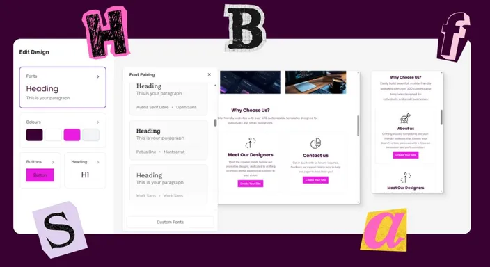
FYI - Our Drag-and-Drop Builder has a built-in font pairing editor in your site design settings, making it hassle-free to choose great looking fonts, that work on any device size! Plus, you even get to preview the font pairings across both devices.
The Two-Font Rule
Professional websites usually keep things surprisingly simple.
Use:
- One font for headings: this can have a little personality.
- One font for body text: clean, simple and easy to read. A sans serif font for web would work well here.
That's it. Two fonts. Not six. Not one different font for every section because "they all looked nice."
Fonts like Inter, Roboto, Open Sans, and Montserrat have become popular for a reason. They aren't flashy. They're readable. And that's exactly what your visitors need.
Let Your Website Builder Do Some Of The Work
If your Website Builder includes font pairing or Global Styles, use them. Set your heading and body fonts once, and every new page will automatically stay consistent. No hunting through pages trying to remember which font you used three weeks ago.
Even better, many Website Builders let you preview your fonts on desktop and mobile before you publish, helping you spot readability issues before your visitors do.
What Font Size Should You Use?
Choosing the right font is only half the story. The size matters just as much.
A beautifully designed font that's too small is still difficult to read, especially on a phone. As a general guideline, body text should usually be around 16 pixels, while headings should be noticeably larger to create a clear visual hierarchy. You also want enough space between each line so paragraphs don't feel cramped.
Think of it like reading a menu in a dimly lit restaurant. If you have to hold it at arm's length or squint to make out the words, something isn't working. Your website should be effortless to read, regardless of the device your visitors are using.
Typography Is More Than Just Choosing Fonts
Typography is simply the art of arranging text so it's comfortable to read.
That includes your font choice, but it also covers spacing, line length, heading sizes, and the way different pieces of text work together on the page. Great typography quietly guides visitors through your content, helping them understand what's important without even thinking about it.
The best websites don't use typography to show off. They use it to communicate clearly. If your headings stand out, your paragraphs are easy to scan, and your buttons are simple to spot, you've already achieved what good typography is meant to do. Sometimes the most effective design choices are the ones your visitors never consciously notice.
Quick Tip
If you're unsure whether your font works, hand your phone to someone else.
If they can comfortably read your headings and paragraphs without zooming in or tilting their head like a confused puppy, you're probably on the right track.
Frequently Asked Questions
What are the best fonts for websites?
The best website fonts are easy to read across different screen sizes. Inter, Roboto, Open Sans, and Montserrat are popular choices because they're clean, versatile, and work particularly well for digital content. Your brand can influence your choice, but readability should always come first.
How many fonts should I use on my website?
For most websites, two fonts are enough. Use one font for headings and another for body text. You can even use one font family with different weights and sizes if you want an especially consistent design. Adding too many fonts can quickly make a website feel cluttered.
What font size is best for a website?
A good starting point for normal body text is around 16 pixels. Headings should be larger so visitors can immediately distinguish different sections of the page. Remember to test your sizes on mobile too, where small text becomes considerably harder to read.
Is serif or sans serif better for websites?
Both can work, but sans serif fonts are particularly popular for body text because their simple letter shapes tend to remain clear on screens. Serif fonts can work beautifully for headings or brands looking for a more traditional feel. Whichever you choose, prioritise readability over style.
How do I choose two fonts that work well together?
Look for fonts that are different enough to create hierarchy without looking like they belong on completely different websites. A characterful heading font paired with a simple body font is usually a safe combination. If your Website Builder offers pre-selected font pairings, that's an easy place to start without becoming a part-time typographer.
That wraps up Week 1: Blank Canvas!
You've gone from a blank page to learning the building blocks of a clean, professional website. Next, we'll start turning that foundation into a website that not only looks good, but helps your business grow.
Or, if you'd like to skip the font guesswork altogether, try HostAfrica's Website Builder free for 14 days and explore professionally paired fonts that look great on every screen.
