
Part of the Blank Canvas series — Day 2 of 7.
Imagine walking into a restaurant where the waiter immediately asks:
"Would you like breakfast, lunch, dinner, dessert, coffee, cocktails, today's special, the takeaway menu, or would you like to book next week's table?"
Before you've even sat down. That's exactly how many small business homepages greet visitors.
Quick tip: That's no way to use utilise your homepage call to action (CTA) to maximize user experience. A convincing call to action is intentional and encourages users with action verbs to take the desired action.
The moment someone lands on the page they're bombarded with:
- Shop Now
- Book a Call
- Read Our Blog
- Join Our Newsletter
- Follow Us on Social Media
- Contact Us
- Download Our Brochure
It's less of a homepage and more of a digital buffet where everything is competing for attention. That's not the way you want to create a sense of urgency, or what creates a great call to action.
It feels like you're being helpful by giving visitors every possible option. Ironically, that's often why they choose none of them.
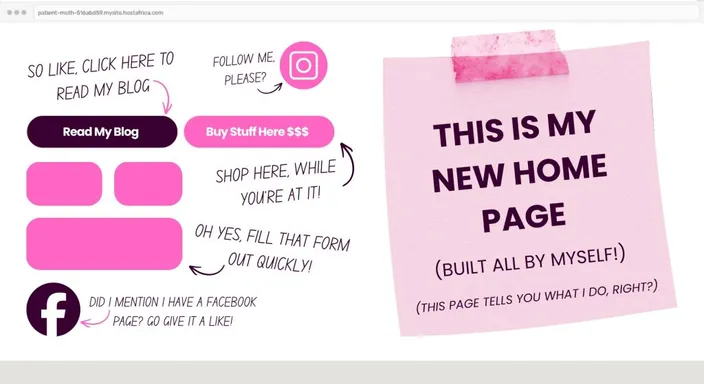
(If you opened a website or web page and this is what you saw, would you even bother scrolling? We didn't think so.)
Key Takeaways: Homepage Call to Action Best Practices
- A homepage call to action (CTA) tells visitors what you want them to do next, such as request a quote, book an appointment, browse products, or contact your business.
- Choose one primary CTA based on the most important action you want homepage visitors to take.
- Place your main CTA above the fold so visitors can see it without needing to scroll, then repeat it naturally further down longer pages.
- Use specific, action-focused button text such as Get a Free Quote, Book an Appointment, or Browse Products instead of vague wording like Submit or Click Here.
- Make your primary CTA visually different from secondary links and buttons so visitors can immediately recognise the most important next step.
- On mobile, CTA buttons should be easy to see, read, and tap without competing with unnecessary links or other page elements.
- You can still include secondary actions on your homepage. The goal is to create a clear visual hierarchy, not remove every other option.
Your Week 1 Roadmap: Blank Canvas to Launch-Ready
This is the second post in a seven-part series. Our aim is to take you from “I don’t know where to start” to a finished, working, simple website or online store. And we do it in one honest, practical step at a time:
- Getting Past the Blank Screen
- Choosing Your One Homepage Goal (this post)
- Finding Your Way Around the Editor
- Writing a Headline People Actually Read
- Ready-Made Sections vs Building Your Own
- Picking Colours Without Overthinking It
- Choosing Fonts People Can Actually Read
The Problem: You're Asking Visitors To Solve Your Puzzle
If your homepage has five different types of CTA, you're asking someone who's known your business for all of eight seconds to figure out what matters most.
That's not their job, it's yours.
A good homepage works like a good tour guide. It doesn't hand you a map, point in six different directions and wish you luck.
It says: "Come this way."
The easier you make that decision with your drag and drop website, the more likely visitors are to take it. Which ultimately boosts conversation rates and click through rates.
The Fix: Decide What's Most Important
Before you open your site builder, ask yourself one simple question:
If 100 people visited my homepage today, what's the one thing I'd want every single one of them to do?
Not two things, not five, just one.
For example:
- Service business websites want visitors to request a quote or make a call.
- Online stores want people browsing products.
- Salons, tutors and consultants want appointments booked.
That's your homepage's main job. Everything else can still exist, it just doesn't need to compete for centre stage.
| Cluttered Homepage | Focused Homepage |
| 5 buttons fighting for attention at the top | 1 clear button, impossible to miss |
| "Welcome to our website" headline | A headline that says exactly what you do |
| Social icons and shop links sharing the spotlight | Social icons tucked into the footer |
| Visitor has to think about what to click | Visitor knows immediately what to do |
What This Looks Like In Practice
A cluttered homepage usually looks something like this:
- Five brightly coloured buttons.
- A "Welcome to our website" headline.
- Social media icons occupying valuable space.
- Three different menus.
- A visitor wondering where to begin.
Imagine that on mobile devices
A focused homepage looks quite different.
It has:
- One clear headline explaining exactly what you do.
- One obvious button.
- Plenty of breathing room.
- A visitor who immediately understands what happens next.
In web design, simple almost always beats busy. Unless you're a bee, in which case carry on.
Build Your Homepage Around One Clear Action
Once you've decided on your primary goal, make it impossible to miss.
A few simple tweaks make a surprisingly notable difference:
- Use one standout colour for your main button.
- Leave plenty of space around it.
- Write button text that tells visitors exactly what they'll get, like "Get a Free Quote" instead of "Submit."
- Move secondary links further down the page or into the footer.
Remember, you're not deleting anything.
You're simply putting the important conversation first. That makes for an effective call to action, whether you need visitors to add to cart, or join your email list.
Where Should You Put a Call to Action on Your Homepage?
Your primary homepage call to action should usually appear near the top of the page, where visitors can see it without scrolling. This is often called above the fold.
Put it close to a headline that explains what your business does. That way, visitors understand your offer and immediately know what to do next.
That doesn't mean you're only allowed one CTA button on the entire page.
On a longer homepage, you can repeat the same primary action after important sections. Someone who wasn't ready to Get a Quote when they arrived might be convinced after reading about your services and customer benefits.
The trick is consistency.
Repeating one clear destination helps visitors. Introducing a completely different adventure every time they scroll brings the puzzle straight back.
Where Should Your Homepage Call to Action Go?
Your primary call to action shouldn't play hide-and-seek.
If someone has to scroll halfway down the page before they discover how to contact you or buy your product, there's a good chance you've already lost them.
The best place for your homepage call to action is above the fold. That's the section visitors see before they start scrolling. Pair it with a clear headline, a short explanation of what you offer, and one obvious button.
That doesn't mean you can only have one CTA on the entire page. Repeating your primary call to action further down the homepage, after you've explained your services or built trust with testimonials, is perfectly fine. Just make sure every button points towards the same goal.
What Makes a Good Call to Action?
A good call to action tells visitors exactly what will happen when they click.
Compare these two examples:
- Submit
- Get Your Free Quote
One feels like paperwork. The other promises a clear benefit.
Whenever possible, start your button with an action word like Get, Book, Download, Start, Browse, or Contact. Then tell visitors what they'll receive in return.
The simpler and more specific your wording is, the less thinking your visitors have to do. And on a busy homepage, reducing even a second of hesitation can make all the difference between someone clicking your button or clicking the back button instead.
Quick Tip for Your Website Builder
If you genuinely can't decide on one homepage goal...
There's a good chance your homepage is trying to be three different websites at once.
That's usually a sign to simplify your message, not add another button or some other drag and drop elements.

(Business Name. Short introduction. One clear call to action. A hero image. That's often all you need above the fold.)
Frequently Asked Questions
What is a call to action on a website?
A call to action (CTA) is a prompt that encourages a visitor to take a specific next step.
On a homepage, that might be Get a Quote, Book an Appointment, Shop Now, or Contact Us. CTAs are usually presented as buttons or prominent links so visitors can easily understand where to go next.
A good CTA removes uncertainty rather than making visitors figure out what they're supposed to do.
How many calls to action should a homepage have?
Your homepage should generally have one primary call to action, but you can repeat that CTA in several places.
For example, a service business might place a Get a Free Quote button near the top and repeat it after explaining its services.
Secondary actions can still appear on the page. Just make sure they don't visually compete with your main goal. Think one priority, not necessarily one button.
Where should I put my homepage call to action?
Place your main CTA above the fold, ideally close to your headline and introductory copy. Visitors should quickly understand what you offer and what you'd like them to do next.
For longer homepages, repeat the CTA naturally after sections that help visitors make their decision.
Don't forget mobile. Check that your CTA remains obvious and easy to tap when your homepage is viewed on a smaller screen.
What should a call-to-action button say?
Good CTA text should tell visitors what will happen when they click.
Instead of generic phrases like Submit, Learn More, or Click Here, use specific wording that matches the desired action. Get a Free Quote, Book Your Appointment, View Our Products, or Start Your Free Trial immediately communicate what comes next.
Keep the wording short, clear, and focused on the action you actually want visitors to take.
Can I have more than one CTA on my website?
Absolutely. Different pages can have different goals.
Your homepage might encourage visitors to request a quote, while a product page encourages them to Add to Cart and a blog post points them towards another useful article.
The important thing is deciding which action matters most on each page. Problems start when five different CTAs are given equal importance and visitors have to decide which one they're supposed to follow.
Next in this series: Finding Your Way Around the Editor →
Want a homepage that's already built around one clear goal? Explore HostAfrica's website builder and start your free 14-day trial today.
