
Part of the Blank Canvas series — Day 5 of 7.
You spend an hour getting everything just right for your professional website. Three images in grid layout line up perfectly in the browser window. The text sits exactly where you want it. You lean back, admire your work, and think:
"Now that's a good-looking website."
Then you click Mobile Preview.
Suddenly one image has wandered off on its own, the text is squeezed into a tiny column, and your carefully crafted layout looks like it lost a fight with gravity.
Don't panic.
Every beginner experiences some horror with responsive web design at least once. Usually more than once. That's one of the reasons web design companies exist - to help create responsive sites for mobile phones as well as desktop.
The good news is that it's not because you're bad at building websites (although that may well be true). It's because you used the wrong drag and drop builder tool for the job.
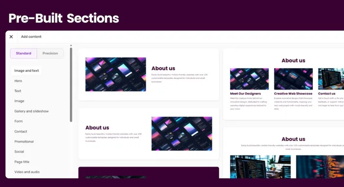
Key Takeaways: Responsive Website Layout
- A responsive website layout automatically adjusts to different screen sizes, including desktops, tablets, and mobile phones.
- Elements that sit side by side on desktop may need to resize, stack, or reposition on smaller screens.
- Pre-built responsive sections are often easier for beginners because images, columns, and spacing are already designed to adapt across devices.
- Use manual drag-and-drop positioning for smaller adjustments rather than constructing complicated page layouts from scratch.
- Mobile-friendly design matters for usability and SEO, especially when visitors arrive from smartphones.
- Always preview important changes on desktop and mobile before publishing. A layout that looks perfect on your computer may behave very differently on a phone.
Your Week 1 Roadmap: Blank Canvas to Launch-Ready
This is the fifth post in a seven-part series. Our aim is to take you from “I don’t know where to start” to a finished, working, simple website or online store. And we do it in one honest, practical step at a time:
- Getting Past the Blank Screen
- Choosing Your One Homepage Goal
- Finding Your Way Around the Editor
- Writing a Headline People Actually Read
- Ready-Made Sections vs Building Your Own (this post)
- Picking Colours Without Overthinking It
- Choosing Fonts People Can Actually Read
The Problem: Too Much Freedom Can Work Against You
For small businesses, website builders give you a lot of freedom. You can move things almost anywhere.
Resize them. Stack them. Arrange them exactly how you want, without requesting any website design services.
That's fantastic on a desktop screen. The trouble starts when someone visits your website on a phone. Then the viewport width you enjoyed on desktop suddenly turns into a user experience nightmare.
What comfortably fits side by side on a large monitor suddenly has to squeeze onto a screen that fits inside your pocket. That's why layouts sometimes overlap, shift around, become difficult to read, or simply aren't user friendly.
What Is a Responsive Website Layout?
A responsive website layout is designed to automatically adapt to the size of the screen that's displaying it.
So, instead of building completely separate pages for desktop computers, tablets, and smartphones, responsive design basically allows the same website to rearrange itself.
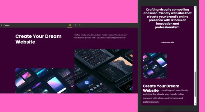
A row containing three services might display as three columns on desktop, for example, but stack into a single column on a phone. That also means images can shrink to fit the available space, while text and buttons stay readable and usable.
That's the important distinction: responsive doesn't mean everything simply becomes smaller.
A good responsive layout reorganises content to suit the available screen.
For beginners, pre-built responsive sections handle much of this work automatically, saving you from manually designing multiple versions of every page.
The Easy Fix: Let Pre-Built Sections Do The Heavy Lifting
Pre-built sections exist for exactly this reason. Instead of manually positioning every element, they already know how to behave on different screen sizes. Basically, they're mobile friendly and automatically adjust to the screen size.
Responsive images resize automatically. Columns stack neatly. Spacing adjusts itself. Everything stays readable without you having to rebuild the layout for every device.
That's why they're one of the easiest ways to create responsive web pages, especially if you're building your first website or online store.
When To Build, And When To Borrow
A simple rule makes life much easier.
Use pre-built sections for:
- Service listings
- Pricing tables
- Testimonials
- Image-and-text layouts
- Multi-column sections
Save manual editing for smaller adjustments like:
- Changing spacing
- Resizing a logo
- Swapping images
- Moving a single button
Think of it like building furniture.
You could cut every plank yourself… Or you could start with something that's already designed to fit together properly. Not only does it save you time, it's not an uncommon web design approach to use pre-built structures.
Besides, cutting every plank is the equivalent of setting the viewport meta tag and other media queries yourself. It can all become technical quite quickly.
The Five-Second Habit You'll Thank Yourself For
Every time you make a change:
- Check the desktop view.
- Switch to Mobile Preview.
- Fix anything that looks odd.
- Continue building.
It takes seconds.
Leaving it until the very end usually means retracing hours of work, which is not what you want when trying to accommodate mobile devices.
Why Is a Mobile-Friendly Website Important for SEO?
Responsive design isn't only about preventing your homepage from looking strange on somebody's phone.
Mobile usability can also affect your website's search performance. Google mostly uses the mobile version of website content for indexing and ranking. This makes a usable mobile experience particularly important.
There's also the human side of SEO.
If visitors arrive from search results and encounter tiny text, overlapping elements, awkward horizontal scrolling, or buttons they can't comfortably tap, they're unlikely to have a particularly good experience.
A responsive website helps ensure the same important content remains accessible and usable across different devices.
You don't need to become an expert in media queries and CSS to achieve that. Start with responsive layouts, keep your design simple, and regularly test the pages your visitors actually see.
Why Mobile-Friendly Design Matters
More people browse the web on their phones than on desktop computers, which means your mobile layout isn't the "secondary" version of your website anymore. For many visitors, it's the only version they'll ever see.
If your text is difficult to read, your buttons are too small to tap, or visitors have to zoom and scroll sideways just to navigate the page, they'll usually leave before learning what you offer. A responsive website layout helps prevent that by automatically adapting to different screen sizes. The easier your website is to use on a mobile device, the more likely visitors are to stay, explore your content, and eventually become customers.
Test Your Website Like a Visitor
Once you've finished building your page, resist the urge to admire it only inside the editor.
Open your website on your own phone. Then try it on a tablet, or ask a friend to open it on a different device. Click every button, browse every page, and imagine you've never visited the website before. Can you find the information you need quickly? Is the text comfortable to read? Does every image load properly?
Sometimes the smallest problems only appear when you experience your website like a real visitor. Spending five minutes testing your responsive website layout can uncover issues that would otherwise cost you enquiries, sales, or frustrated customers later.
Quick Tip
Don't worry if a pre-built section feels slightly more structured than something you could create from scratch. That structure is exactly what helps it work beautifully across laptops, tablets, and phones.
Reliable almost always beats clever. Plus, you're aiming for online presence. When you start trying to be too clever you risk needing professional web design skills.
That's why custom website design and affordable web design have major cost differences
Frequently Asked Questions
Will pre-built sections make my website look generic?
Not necessarily. Pre-built sections provide the underlying structure, but you still control the content visitors actually experience.
Change the colours, fonts, images, headings, buttons, and other branding elements to match your business. Two websites can use a similar responsive layout while looking completely different.
Think of the section as the floor plan. How you decorate the house is still entirely up to you.
Why does my desktop website look perfect but my mobile version doesn't?
Desktop screens provide considerably more horizontal space. A layout with several columns, large images, and long headings can therefore look perfectly comfortable on a monitor but become crowded on a smartphone.
Responsive layouts solve this by rearranging elements for smaller screens.
Use Mobile Preview throughout the building process rather than treating mobile testing as something you do five minutes before publishing.
Should I always use pre-built sections?
They're particularly useful for more complicated layouts such as pricing tables, testimonials, service grids, galleries, and image-and-text sections.
Because the responsive behaviour is already built into the structure, there's less chance of accidentally creating something that falls apart on smaller screens.
You can then use manual editing for smaller adjustments and finishing touches.
What's the difference between responsive and mobile-friendly web design?
The terms are often used together, but there's a useful distinction.
A responsive website actively adapts its layout according to the available screen size. Columns might stack, images resize, and spacing changes automatically.
Mobile-friendly is a broader description for a website that's comfortable to use on a phone.
A properly implemented responsive design is therefore one of the main ways to make your website mobile-friendly.
How do I test whether my website is responsive?
Start by using the desktop, tablet, and mobile previews available in your Website Builder.
Then test the published website on a real smartphone if possible. Check whether headings fit properly, text is readable, images resize correctly, menus work, and buttons are easy to tap.
Don't only inspect the homepage either. Test important service, product, contact, booking, or checkout pages that customers are likely to use.
Does responsive web design help SEO?
Responsive design can support SEO by helping you provide a usable mobile experience and making your content accessible across different devices.
Google uses the mobile version of a site's content for indexing and ranking, so it's important that your important text, links, images, and other content work properly on mobile.
Responsive design isn't an SEO shortcut that automatically improves rankings, but it's an important part of creating a technically sound, user-friendly website.
Next in this series: Picking Colours Without Overthinking It →
Or, if you'd rather spend your time growing your business than fixing broken layouts, explore the pre-built section library in HostAfrica's Website Builder with a free 14-day trial.
