
Part of the Blank Canvas series — Day 6 of 7.
Picking your colour scheme for your website should be fun. Instead, it usually goes something like this:
"That blue looks nice."
"Ooh… so does this one."
"Actually, maybe green."
"Purple?"
Three hours later you're comparing your 47th shade of teal and questioning every life decision that brought you here. We know, colour psychology and colour palettes can quickly turn into it's own project.
The problem isn't that choosing colours is difficult. It's that you have too many choices. Fortunately, designers have been solving this problem for years with one surprisingly simple rule. And you don't need an advanced understanding of colour theory.
Key Takeaways: How to Choose Website Colours
- Most small business websites don't need dozens of colours. Start with a simple three-colour palette and build from there.
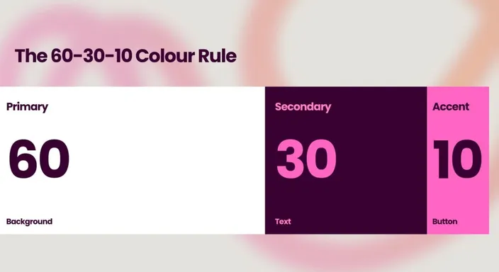
- The 60–30–10 rule uses roughly 60% for your background or dominant colour, 30% for your primary brand colour, and 10% for an accent colour.
- Reserve your accent colour for important elements like buttons and calls to action so they naturally attract attention.
- If you already have a logo or established branding, use those colours as the starting point for your website colour palette.
- Choose colours that provide enough contrast between text, backgrounds, and buttons so your website remains easy to read.
- Use Global Styles or Theme Settings to apply your colour palette consistently across your website instead of manually styling every page.
Your Week 1 Roadmap: Blank Canvas to Launch-Ready
This is the sixth post in a seven-part series. Our aim is to take you from “I don’t know where to start” to a finished, working, simple website or online store. And we do it in one honest, practical step at a time:
- Getting Past the Blank Screen
- Choosing Your One Homepage Goal
- Finding Your Way Around the Editor
- Writing a Headline People Actually Read
- Ready-Made Sections vs Building Your Own
- Picking Colours Without Overthinking It (this post)
- Choosing Fonts People Can Actually Read
The Problem: Too Much Choice Creates Chaos
Without a plan, most beginners fall into one of two traps. They either pick one colour and use it everywhere, making the website feel flat. Or they use five different colours because they all look good individually.
The result?
Buttons don't stand out. Headings compete with banners. Visitors aren't sure what's important anymore because of the primary colours clash with the secondary colours. The list goes on.
A good website doesn't need more colours. It needs better colour priorities.
The Simple Rule: 60–30–10
Professional designers often use what's known as the 60-30-10 Rule.
- 60% — Your background colour (usually white, light grey or another neutral).
- 30% — Your main brand colour for headings, navigation and larger design elements.
- 10% — Your accent colour, reserved for buttons and important calls to action.
That's it.
Three colours. Not seven. Not twelve. Just three colour combinations working together.
How Do You Choose Website Colours That Work Together?
If you don't already have brand colours, you don't need to stare at a colour wheel until it starts staring back.
Start with one primary colour that suits your business. Then choose a neutral background such as white, off-white, or light grey, and an accent colour that clearly contrasts with both.
A colour wheel or online palette generator can help you find complementary colours if you're unsure what works together. But don't feel obligated to use every colour it suggests.
Remember the 60–30–10 rule. You're building a website, not assembling the complete paint catalogue.
Once you've chosen your palette, test the colours together on actual headings, buttons, backgrounds, and other website elements. Colours can look very different in context than they do sitting neatly beside each other in a palette.
Why This Works
Think of your website like getting dressed for a special occasion. Your outfit might be mostly one colour. Your jacket adds personality. Your watch or shoes provide the finishing touch.
If every item was bright orange, leopard print and glitter... People probably wouldn't remember what you said. The same applies to your website. The less your colours compete, the more visitors focus on your message.
[█████████████████████████████████ 60%][████████████ 30%][███ 10%] Background Brand Accent
Set Your Colours Once
One mistake many beginners make is manually changing colours on every page. Don't. If you're using the best website builder for beginners, look for the Global Styles or Theme Settings.
Set your three complementary colours once, and every new page, heading and button will automatically stay consistent. Future you will be very grateful.
How Colour Influences Visitor Decisions
Colours don't just make a website look attractive. They influence how people feel while they're browsing.
Blue is often associated with trust and reliability, which is why it's popular with banks and technology companies. Green is commonly linked to growth, health, and sustainability. Orange and yellow create a sense of energy, while darker colours can make a brand feel more premium.
That doesn't mean there's one perfect colour for every business. The goal isn't to manipulate visitors with colour psychology. It's to choose colours that reflect your brand and use them consistently. When your website colours reinforce your message instead of distracting from it, visitors are more likely to remember your business.

Don't Forget About Colour Contrast
Your colour palette can look beautiful and still make your website surprisingly difficult to use.
The usual culprit is poor colour contrast.
Light grey text on a white background might look wonderfully minimalist on your monitor. On a phone outside in bright sunlight, it can become practically invisible. The same problem occurs when button colours don't stand out clearly from the background.
Make sure important text is easy to read and your calls to action are immediately visible. This is particularly important for visitors with visual impairments.
You don't need to abandon your brand colours. You may simply need to use lighter or darker variations in the right places.
Think of contrast like road signs: looking stylish is nice, but being immediately readable is the actual job.
Quick Tip
Already have a logo? Start there. Using the colours from your existing branding instantly makes your website feel more polished and recognisable. It also adds to the user experience since the entire colour wheel is not visually assaulting any unsuspecting visitor.
After all, it's part of your brand identity. There's no need to reinvent your brand every time you build a new page.
Frequently Asked Questions
How many colours should a small business website use?
Three is a great starting point for most small business websites.
Use one dominant or background colour, one primary brand colour, and one contrasting accent colour for important elements such as buttons and calls to action.
You can introduce additional shades where necessary, but they should support your main palette rather than turning every section into a new colour scheme.
What if I don't have brand colours yet?
Start with one primary colour that suits the personality of your business, then build a simple palette around it.
Pair it with a neutral background and an accent colour that provides enough contrast for important buttons and links.
You can use a colour wheel or palette generator for inspiration, but don't overcomplicate the decision. Your first colour palette doesn't need to win a design award. It needs to look consistent and make your website easy to use.
Can I add more colours later?
Absolutely.
The 60–30–10 rule isn't a law enforced by the website design police. It's simply a useful starting point that prevents beginners from introducing too many competing primary and secondary colours.
As your brand develops, you might add secondary colours for specific sections, illustrations, notifications, or other design elements.
Just make sure your original hierarchy remains clear.
What colours are best for a website?
There's no single best website colour scheme for every business.
The right colours depend on your branding, audience, industry, and the feeling you want your website to create. A children's business and an accounting firm probably shouldn't look like they accidentally swapped websites. That means avoiding sharp combinations like deep blue and yellow, or bright red and yellow.
Rather than chasing a universally "perfect" colour, focus on consistency, readability, contrast, and your existing brand identity.
Why is colour contrast important in web design?
Good contrast makes text, buttons, links, and other important elements easier to see.
For example, dark text on a light background is generally much easier to read than light grey text on white. Your CTA buttons should also contrast clearly with the surrounding page so visitors can identify them quickly.
Colour contrast improves general usability and is also an important part of making your website more accessible to people with visual impairments. When in doubt, black and white can be a useful temporary solution.
Next in this series: Choosing Fonts People Can Actually Read →
Or, if you'd like to see how easy it is to apply colours across your entire website, start a free 14-day trial of HostAfrica's Website Builder and set your colour palette in minutes.
