
Part of Week 2: Feature Activation — Day 14.
You've finally finished your website. The pages look great, you explain your services are clearly, people are visiting. Then... nothing.
No enquiries, quote requests, and no new leads. Before blaming your marketing, it might help to look at your contact form. Your contact form might be asking your visitors to do far more work and give more contact information than they're willing to do.
Key Takeaways: Contact Form Best Practices
- Keep contact forms short and easy to complete. For many small businesses, a name, contact method, and message are enough to start the conversation.
- Only make a field required if you genuinely need that information before you can respond. Every unnecessary question adds friction.
- Place your contact form where interested visitors can easily find it. This includes a dedicated Contact page and relevant service pages.
- Use a clear call-to-action such as Get a Quote or Send My Enquiry instead of vague button text like Submit.
- Always show a confirmation message after submission and test your form regularly to make sure enquiries actually reach you.
Your Week 2 Roadmap: Feature Activation
Getting your site live in Week 1 was step one. Now it’s time to switch on the features that actually make your business money: stores, bookings, payments, and the small details that turn visitors into customers. Here’s what’s ahead:
- Why You’re Putting Off Launching Your Store
- Why Clients Still WhatsApp You Instead of Booking Online
- Why Visitors Skim Past Your “About Us” Section
- Why “Setting Up Payments” Feels Scarier Than It Is
- Why You’re Afraid to Turn On Online Bookings
- Why Your Photos Are Quietly Hurting Your Site
- Why Your Contact Form Isn’t Getting Submissions (this post)
The Problem: You're Starting With An Interview
Imagine walking into a coffee shop.
Before anyone offers you a menu, they ask for:
- Your full name
- Your address
- Your budget
- How you heard about them
- Your long-term goals.
You'd probably turn around and leave.
That's exactly how many contact forms make people feel, and why they'd rather not fill out the form altogether.
Someone simply wants to make an inquiry, but your form meets them with a line of questioning that looks more like a mortgage application.
Keep It Simple
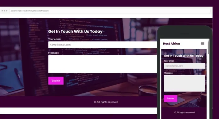
When creating a contact form, know that it doesn't need to know everything. It only needs enough information to start the conversation. For most businesses, that's just three fields:
- Name
- Email address or WhatsApp number
- Message
That contact form template works well enough. Your site builder's drag and drop contact form builder should suffice.
Once someone gets in touch, you can build trust and ask the rest during your follow-up conversation. Removing unnecessary form fields often results in more enquiries, not fewer. Besides that, it also makes for a more user friendly contact us page.
Where Should You Put a Contact Form?
A beautifully simple contact form won't generate many enquiries if visitors need an archaeological expedition to find it.
For most small business websites, your main form belongs on a dedicated Contact page, at the top of the page. You should also have an obvious Contact link in your navigation. If generating enquiries is one of your website's primary goals, placing a shorter form or clear link to it on important service pages goes a long way.
Think about when a site visitor is most likely to contact you. A visitor who has just finished reading about your plumbing service shouldn't need to return to the homepage and begin hunting.
Put the opportunity to enquire close to the moment they're ready to act. That'll have a positive effect on your conversion rate. Good contact form placement isn't about showing the form everywhere. It's about making sure it's there when somebody needs it.
Make Saying "Hello" Easy
Remember, your contact form has one job:
Lower the barrier between a visitor and a conversation.
The easier it is to complete, the more likely people are to press Send and get you those form submissions. A short message from an interested customer is far more valuable than a perfectly structured online form that nobody finishes.
Your Contact Form Button Matters Too
You've removed six unnecessary fields, simplified the form and made everything beautifully easy. Great contact form design, but then your button says:
Submit.
Technically accurate. Not particularly inspiring.
Your form's call-to-action should make it clear what happens when someone clicks it. Depending on your business, that could be Get a Quote, Send My Enquiry, Request a Callback, or simply Send Message.
The wording doesn't need to perform Shakespeare. It just needs to feel specific and reassuring.
Your button should also be easy to spot, especially on mobile devices. Give it enough contrast and breathing room so visitors immediately recognise the final step.
After all, if someone has completed your entire form, this isn't the moment to make the exit difficult to find.
What Should Happen After Someone Submits Your Form?
Pressing Send and seeing absolutely nothing happen is surprisingly unsettling.
Did the message go through? Should they press it again? Has their enquiry disappeared into the internet wilderness?
Always give visitors a clear form submission confirmation. A simple message such as "Thanks! We've received your enquiry and will get back to you within one business day" immediately removes uncertainty.
If possible, tell them roughly when they can expect a response and provide another contact option for genuinely urgent enquiries.
Then make sure notifications are reaching the right person on your side too. Test the complete process yourself occasionally: form, confirmation and notification.
A contact form isn't finished when the button works. It's finished when both sides know the message arrived.
Quick Tip
If you're unsure whether a field is necessary, ask yourself:
"Do I absolutely need this before I can reply?"
If the answer is no, remove it. Asking later is always possible .
FAQs: Contact Us Page Best Practices
How many fields should a contact form have?
There's no perfect number for every business, but shorter is generally better. For a basic enquiry form, three fields are often enough: name, email address or WhatsApp number, and a message.
If you need additional information to provide an accurate quote, add it carefully. Just remember that every extra required field gives visitors another opportunity to decide they'll "do it later."
Should I ask for a phone number?
Only if you genuinely need it to follow up.
If email works just as well, consider letting visitors choose their preferred contact method instead. Some people are perfectly happy receiving a call. Others treat an unexpected phone call like you've challenged them to a duel.
Giving visitors options can make contacting you feel more comfortable.
Can shorter forms attract lower-quality leads?
They can make it easier for everyone to enquire, but that doesn't necessarily mean your leads will be worse.
Long forms can discourage excellent prospects who simply don't have time to answer ten questions. Start by making contact easy. You can qualify the enquiry during your follow-up conversation.
Where should I put my contact form?
Your dedicated Contact page is the obvious starting point, but it doesn't have to be the only one.
If someone reaches the end of an important service page, for example, that's a natural moment to offer a form or link to one. Put your contact option close to places where visitors are likely to decide they're interested.
Which contact form fields should be required?
Only require information you absolutely need to respond.
For most businesses, that's a name, a reliable contact method, and enough information to understand the enquiry. Details like budgets, addresses, company size, or preferred appointment dates can often wait until later.
What should my contact form button say?
Choose wording that describes what the visitor is actually doing.
Send Message, Get a Quote, Request a Callback, or Send My Enquiry are clearer than Submit. Your visitor should know exactly what happens when they press the button.
How do I know whether my contact form is working?
Test it yourself.
Complete the form on both desktop and mobile, press Send, check that the confirmation appears, and make sure the enquiry reaches the correct inbox.
Do this periodically rather than discovering three months later that your contact form has been enthusiastically sending enquiries into the digital abyss.
That wraps up Week 2: Feature Activation!
You've learned how to activate the features that turn a website into a working business. With online stores and bookings to payments, images, and contact forms, you're well on your way to making your website a lasting success.
Ready to start capturing more enquiries? HostAfrica's Website Builder includes professionally designed contact forms that are easy to customise and even easier for your visitors to complete.
