
Day 18 of the Week 3: Layout and Polish series.
A visitor lands on your homepage and sees two buttons sitting side by side.
One says "Request a Quote." The other says "See Our Past Work."
Both are the same size, same colour, and same style.
So the visitor's eye bounces between them, trying to figure out which one you want them to click. They often end up clicking neither.
When everything looks equally important, nothing does.
Key Takeaways: Primary vs Secondary Buttons
- Primary buttons highlight the main action you want visitors to take, such as booking, buying, signing up, or requesting a quote.
- Secondary buttons support the main action with alternatives like Learn More, View Our Work, or Read Reviews.
- Use stronger visual weight for primary buttons, such as a solid fill and high contrast, while secondary buttons should be more subtle.
- Keep one clear primary action per page so visitors don't have to decide which button matters most.
- Consistent button styling creates a clear visual hierarchy, helping visitors understand what to do next without overthinking it.
Your Week 3 Roadmap: Layout and Polish
Weeks 1 and 2 got your website online. Now it’s time to make it shine.
Over the next week we’ll cover:
- Why You Haven’t Touched Your Website Since You Published It
- Why Your Site Looks Cluttered Even With Good Content
- Why Your Footer Is a Missed Opportunity
- Why All Your Buttons Look Equally Important (this post)
- Why Your Navigation Menu Is Confusing People
- Why Clicking Your Own Site Reveals More Broken Things Than You Expected
- Why You’re Afraid to Experiment With Your Layout
The Problem: Identical Styling Is a Silent Conversion Killer
Every page you build with a website builder for small business gives you creative freedom over your buttons. This is great for flexibility, but it also means the styling decision is entirely yours to make.
Most beginners pick a style they like, apply it to every button on the site, and move on. It looks consistent, so it feels right.
The problem is that two identically styled buttons side by side communicate nothing about which one matters more.
They present equal options to a visitor who's looking for a clear path, and when there's no clear path, a significant portion of those visitors will take no path at all.
Here's what happens:
- Visitor reads your homepage and likes what they see
- At the bottom, they see two identically styled buttons
- Their brain doesn't know which one to click
- Instead of guessing, they leave the page
This is especially damaging because the visitor was already interested. You had them. But you didn't make it clear what you wanted them to do next.
The Fix: Two Button Styles, Two Different Jobs
You only need two distinct button styles to solve this problem, and the difference between them is intentional and visual.
The Primary Button: Your Main Goal
Purpose: This is the action you most want visitors to take: booking, a quote request, a purchase, a sign-up.
Style: Solid, filled background in your accent colour (the vivid 10% colour from your brand palette)
Why: It should be visually unmissable. The filled background commands attention. When visitors scan the page, the primary button is what they see first.
The Secondary Button: The Alternative Path
Purpose: This is for things like "View Our Work," "Read Reviews," "Learn More," or "Download Brochure." These support the main goal but aren't the priority.
Style: Outline style, transparent background with a thin border and matching text (same colour as the border)
Why: It's present and available, but clearly not the priority. The outline (rather than solid fill) makes it recede visually while remaining functional.
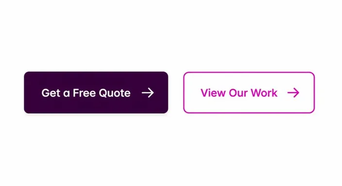
Why This Visual Difference Works
Primary vs Secondary at a Glance:
PRIMARY BUTTON
Visual weight: Heavy (solid fill, high contrast)
Message: "This is what I want you to do"
Best for: Booking, purchase, quote request, sign-up
Colour: Your accent colour (vivid, stands out)
SECONDARY BUTTON
Visual weight: Light (outline only, subtle)
Message: "This is also available, but optional"
Best for: Learn more, view portfolio, download, read reviews
Colour: Same as primary (consistency) but outline only (lower emphasis)
The visual difference between a filled button and an outline button tells your visitor, without any words, which one the page considers more important. Most people will follow that cue naturally, without overthinking it.
How to Implement This on Your Site
Step 1: Create two button styles in your website builder. Most builders let you save button styles. Create one called "Primary Button" and one called "Secondary Button."
Step 2: Style the Primary Button. Solid fill, your accent colour, white text. Make it prominent.
Step 3: Style the Secondary Button. Outline only, same accent colour (border and text), no fill, slightly smaller or thinner.
Step 4: Audit every button on your site. Go through each page and ask: "Is this button trying to achieve my main goal (primary) or support it (secondary)?" Apply the correct style.
Step 5: Never mix them on the same visual level. If you have both buttons on the same page, place the primary button higher or give it more space. Make the hierarchy clear.
Common Button Mistakes and Fixes
Mistake 1: Three or more button styles
Fix: Stick to two. If you have more than two, you'll confuse visitors. Everything beyond primary and secondary should be a link, not a button.
Mistake 2: Making secondary buttons too prominent
Fix: Secondary buttons should have less visual weight. Outline, smaller text, or lighter colour, pick one or two to make it clearly less important than primary.
Mistake 3: Using different colours for primary and secondary
Fix: Use the same colour family. The difference should be fill (solid vs. outline), not colour. Colour differences can create visual confusion about what to do.
Mistake 4: Inconsistent sizing
Fix: Primary buttons should be slightly larger or have more padding than secondary. Consistent sizing makes the hierarchy clear.
Mistake 5: Too many buttons on one page
Fix: If a page has more than one primary button, the visitor won't know which is more important. Limit to one primary action per page, with optional secondary actions.
Button Styling Checklist
Before publishing, check each page:
- Does this page have a clear primary button (the main goal)?
- Is the primary button visually distinct (filled, prominent)?
- Are all secondary buttons styled differently (outline, lighter)?
- Is there only one primary button action per page?
- Are buttons consistently sized and spaced?
- Do all buttons follow the same style across the site?
Quick win: Once you've styled both button types, go through every page and ask: "Is there anywhere a secondary button is currently styled like a primary one?" If yes, swap it out. That's the quickest conversion improvement you can make in under ten minutes.
Frequently Asked Questions
What if I only have one button on a page?
Great. Make it a primary button and give it plenty of space around it. A single, well-styled call-to-action with no competition is the ideal scenario. A visitor won't have to wonder what to do.
Should every page have both a primary and secondary button?
Not necessarily. Only add a secondary option if it's genuinely useful for visitors who aren't ready for the primary action. If it doesn't serve a real purpose, leave it out. A clean page with one clear button is better than a confusing page with multiple options.
Can I use different colours for primary and secondary buttons?
You can, but it's usually unnecessary and adds complexity. Using the same colour (filled for primary, outline for secondary) is cleaner and makes the hierarchy clear through styling, not colour. Colour differences can make visitors uncertain about whether to use one or the other.
What size should primary vs secondary buttons be?
Primary buttons should be slightly larger, have more padding, a bigger font, or a taller height. Secondary buttons should be visibly smaller. This creates a visual hierarchy without needing colour differences.
How many primary buttons is too many on one page?
More than one primary button on the same page confuses visitors about which action matters most. Stick to one primary action per page. Everything else should be secondary.
Should I apply primary/secondary styling to all buttons, even in footers or headers?
Navigation buttons and footer buttons are typically styled differently (often as text links or icon links). Primary/secondary styling is most important for action buttons. The ones that move visitors toward a conversion (book, buy, sign up, contact).
Next in this series: Why Your Navigation Menu Is Confusing People →
Ready to optimize your buttons for conversions? Open the HostAfrica Website Builder and audit every button on your site today. Swap secondary buttons to outline style and watch your conversion clarity improve.
