
Part of Week 3: Layout and Polish — Day 16.
Imagine walking into a beautifully furnished living room where every piece of furniture has been pushed into the middle of the floor.
The sofa is touching the coffee table, the coffee table is touching the TV stand. There isn't enough room to move, let alone relax.
Now imagine the same room with exactly the same furniture, but everything is spaced out. Suddenly it feels bigger, calmer and far more inviting.
Your website works the same way. Sometimes it isn't your content making the page feel busy, it's the amount of white space around your content.
Key Takeaways: White Space in Web Design
- White space in web design is the empty space around and between text, images, buttons, and other page elements. It doesn't have to be white.
- Good white space makes a website easier to read, scan, and navigate by preventing different elements from competing for attention.
- Micro white space is the smaller spacing between elements, while macro white space separates larger sections of a page.
- Adding space around important elements like headlines and calls to action can help them stand out.
- You can create more white space by adjusting section padding, paragraph spacing, and the space around buttons and images.
- The goal isn't to make your website empty. It's to give each piece of content enough room to do its job.
Your Week 3 Roadmap: Layout and Polish
Weeks 1 and 2 got your website online. Now it’s time to make it shine.
Over the next week we’ll cover:
- Why You Haven’t Touched Your Website Since You Published It
- Why Your Site Looks Cluttered Even With Good Content (this post)
- Why Your Footer Is a Missed Opportunity
- Why All Your Buttons Look Equally Important
- Why Your Navigation Menu Is Confusing People
- Why Clicking Your Own Site Reveals More Broken Things Than You Expected
- Why You’re Afraid to Experiment With Your Layout
What Is White Space?
Despite the name, white space doesn't have to be white. Simply put, it's the breathing room between the different elements on your page.
Think of it like punctuation in a sentence. Without spaces between words, reading becomes exhausting. The same happens on a website.
When headlines, images and buttons are crammed together, visitors have to work harder to understand your page. But give each element a little room to breathe, and your content becomes easier to scan. This in turn makes it easier to understand and far more enjoyable to read.
Sometimes, adding nothing is exactly what your website needs.
Micro vs Macro White Space
White space comes in two forms: micro and macro. Micro white space is the small spacing between individual elements. Things like the gap between a heading and a paragraph, the space between lines of text, or the padding around a button. These subtle spaces improve readability and make your content easier to scan without visitors even noticing why.
Macro white space is the larger empty space that separates sections of your page. Basically, the generous padding between your hero banner and the next section. Or the space that keeps your testimonials from running into your pricing table.
Macro white space helps organise your content into clear sections. This gives visitors visual breaks and making your website feel clean, professional, and easy to navigate.
Why Is White Space Important in Web Design?
White space helps visitors understand what belongs together, what deserves their attention, and where one section ends and another begins.
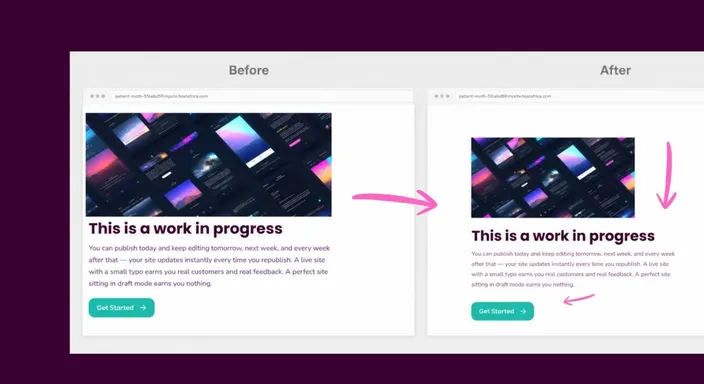
Without enough spacing, even good content can become difficult to read. Headlines disappear into paragraphs, buttons compete with nearby images, and separate sections start looking like one enormous block.
Add some breathing room and the page becomes much easier to scan.
White space can also create visual hierarchy. Important elements get room to stand out, while related content can sit closer together.
Think of it as organising a desk. You don't necessarily need fewer things. Sometimes you just need to stop stacking everything on top of everything else.
The Problem: Filling Every Gap
When you're building your first website, empty space can feel... well, empty. You might think, "I should add another photo here." Or maybe another paragraph. Or another CTA button.
After all, you've worked hard on your content. Why not show as much of it as possible? The trouble is, when every visual element competes for attention, nothing stands out.
Visitors don't read websites from top to bottom like a book. They scan. Using white space effectively quietly guides their eyes from one important element to the next. This helps them understand your page without feeling overwhelmed.
Of course, this is great for overall user experience and a key factor of sleek website design.
Negative Space: Say More With Less
Think about an art gallery. The paintings aren't hung edge-to-edge until every wall is covered. Each one has room around it.
That empty space isn't wasted, it's actually what helps you appreciate the artwork. Your website deserves the same treatment. A strong headline becomes easier to notice when it isn't squeezed between other elements.
A call-to-action button attracts more clicks when it has space around it. Even a simple paragraph feels more inviting when readers don't see it as one giant block of text. Sometimes the biggest improvement you can make is resisting the urge to add something new.
That's how you use white space to improve your web pages without actually adding anything.
Three Easy Ways to Create White Space
You don't need to redesign your website to make it feel cleaner.
Try these small improvements instead:
- Increase your section padding. Add more space above and below each section so your content has room to breathe.
- Separate headings from paragraphs. A little extra spacing makes each section easier to scan.
- Give your buttons some breathing room. Keep your main call-to-action away from surrounding text or images so it naturally draws attention.
Quick Tip
If you're unsure whether your page feels crowded, squint at your screen.
Seriously.
Blurring the details makes the overall layout easier to judge. If everything blends into one large shape, add more space. If the important elements stand out on their own, you're on the right track.
Frequently Asked Questions
How much white space should my website have?
There isn't a perfect number of pixels that works for every website.
Aim for enough space that headings, paragraphs, images, buttons, and individual sections feel clearly separated without looking disconnected. If visitors can quickly scan the page and understand its structure, you're probably heading in the right direction.
Can too much white space make my website look empty?
Yes. Too much space between related elements can make a page feel disconnected or force visitors to scroll unnecessarily.
However, beginners are generally more likely to squeeze too much onto a page than leave too much room. Add space gradually and preview the finished layout on both desktop and mobile.
What is the difference between white space and negative space?
In web design, white space and negative space generally describe the same idea: the unused space around and between page elements.
Neither term means the area actually needs to be white. Your negative space could be blue, black, beige, or whatever background colour fits your design.
Does white space improve website readability?
Yes. White space around headings, paragraphs, and other content can make a page easier to scan and less tiring to read.
It gives different pieces of information some separation instead of presenting visitors with one giant wall of content. Think punctuation for your layout rather than your sentences.
Should I use more white space on mobile?
Often, yes, but it needs to be used carefully.
Smaller screens can feel cluttered quickly, so clear spacing between text, buttons, images, and sections becomes particularly useful. Just avoid enormous gaps that leave mobile visitors scrolling through acres of empty space to reach the next section.
Next in this series: Why Your Footer Is a Missed Opportunity →
Ready to make your website feel cleaner without rewriting a single word? Open the HostAfrica Website Builder and experiment with your spacing. A few extra pixels of breathing room can completely change how professional your website feels.
