
Day 25 of the Week 4: Trust, Conversion & Launch Technicals series.
You've checked your site in the editor's mobile preview. Everything looks fine. The layout stacks, the buttons are visible, and the text is legible.
Then you open it on your actual phone and something feels slightly off.
Text that's a little small and button that's hard to tap. Throw in a three-column section that's technically stacked but still feels cramped.
There's a simple way to catch these issues: check your website on mobile using a real device.
We call it the thumb test, and it takes about two minutes.
Key Takeaways: How to Check Your Website on Mobile
- Check your website on mobile using a real device, not only your Website Builder's preview.
- Open your live website, hold your phone one-handed, and navigate the page using only your thumb.
- Check that text is comfortable to read, buttons are easy to tap, and multi-column sections stack cleanly on smaller screen sizes.
- A responsive website can still have mobile usability problems with spacing, font sizes, images, and touch targets.
- Test important pages on multiple devices and screen sizes when possible, but your everyday phone is a good place to start.
- Fix anything that makes you hesitate, zoom, scroll sideways, or repeatedly miss a button.
Your Week 4 Roadmap: Trust, Conversion & Launch Technicals
You’ve built the site, switched on the features, and polished the design. Week 4 is about the final layer, the technical and trust signals that tell visitors and search engines your site is legitimate, secure, and ready for business:
- How to Connect Your Domain to Your Website
- Why Your Site Might Show a “Not Secure” Warning After Launch
- Why You Think You Need to Transfer Your Domain (You Probably Don’t)
- Why Your Site Looks Perfect on Your Laptop but Loses Customers on Their Phones (this post)
- Why Your Last Check Before Launch Is the Most Important One
- Why Nobody Trusts a Website With No Reviews On It
- Why Your Site Looks Different in Your Browser Than on Everyone Else’s
- How Subdomains Let You Grow Without Starting Over
- The 5-Point Launch Checklist: How to Know You’re Actually Ready
Why Should You Check Your Website on Mobile?
Responsive web design helps your website adapt to different screen sizes, but responsive doesn't automatically mean comfortable to use.
Your Website Builder might correctly move three columns into one. Your text might fit within the screen. Your button might technically be visible.
But none of that tells you what the mobile experience actually feels like. That's why it's worth testing your website on a real phone before launch.
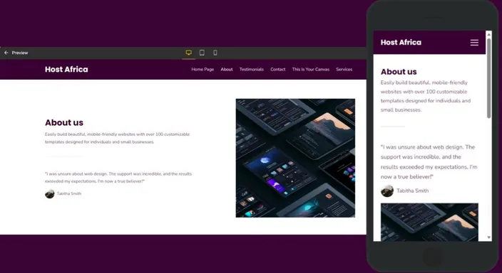
The Problem: The Preview Panel Isn't a Real Device
Your editor's mobile preview is useful. It shows you roughly how your site responds to a smaller screen.
But it can't show you what the website feels like when you're holding an actual phone.
A button can be visible but difficult to tap. Text can fit but be uncomfortable to read. Sections can stack correctly but still feel cramped.
The preview shows you the structure. The thumb test shows you the usability.
The Solution: Check Your Website on Mobile With the Thumb Test
This is straightforward and hands-on.
- Pick up your phone. Use the real device you normally browse on.
- Open your live website. Type your domain into Chrome, Safari, or your usual browser rather than using the editor preview.
- Hold your phone naturally. One hand, relaxed grip, thumb ready to tap and scroll.
- Go through your homepage using only your thumb. Read the headline, find your main button, scroll through the sections, and follow a link.
- Notice what feels difficult. If you hesitate, zoom, miss a button, or struggle to read something, you've found something worth fixing.
You don't need specialist software to test websites this way. You're simply experiencing your site the way a visitor might.
Three Things to Check on Your Mobile Website
1. Can You Read the Headline Without Zooming?
Your headline and body copy should be comfortable to read at a normal phone viewing distance. Look for text that's too small, awkward line breaks, or paragraphs that feel crowded.
If it fails: Increase the font size or line spacing and check it again on your phone.
2. Can You Tap the Main Button Easily?
Your primary call-to-action should be large enough to tap comfortably without accidentally hitting something next to it.
As a useful benchmark, interactive elements should have a sufficiently large touch target. Somewhere around 44 × 44 pixels is the usual recommendation.
Also give buttons enough breathing room from nearby links and other tappable elements.
If it fails: Increase the button size or padding and add more space around it.
3. Do Your Sections Stack Cleanly?
A multi-column desktop layout should adapt comfortably to smaller screen sizes.
Check that cards stack correctly, images scale without distortion, and there's enough vertical space between sections.
Also watch for horizontal scrolling. If you need to swipe sideways to see part of the page, something probably isn't responding correctly.
If it fails: Check the responsive settings in your Website Builder and adjust the spacing, widths, or image sizing.
Should You Test Your Website on Multiple Devices?
Start with your own phone. That's far more useful than endlessly resizing a preview window.
If you have access to multiple devices, check the site on another phone with a different screen size too. You don't need a drawer full of smartphones or a secret testing laboratory.
The goal isn't to manually test every device ever made. It's to catch obvious differences in the mobile experience.
You can also ask someone else to try the thumb test.
Quick Tip: Give your phone to someone who hasn't seen the site before and watch where they tap or hesitate. You already know where everything is. A first-time visitor doesn't.
Quick Mobile Website Checklist
Before you're finished, check that:
- Text is readable without zooming
- Your main CTA is easy to tap
- Buttons aren't crowded together
- Multi-column sections stack properly
- Images scale correctly
- There's no horizontal scrolling
- Navigation works comfortably with one hand
- Important information isn't hidden or difficult to reach
Fix the issues you find, publish the changes, and check the website on mobile again.
That's the simplest way to check responsive behaviour and real-world usability.
FAQs: Check Website on Mobile Devices
Does a pre-built section guarantee my site is mobile-friendly?
Not completely. Pre-built sections can handle basic responsive behaviour, but font sizes, spacing, buttons, and images may still need adjustment.
What's a good tap target size for mobile buttons?
Around 44 × 44 pixels is a useful benchmark for tappable elements. More importantly, the button should feel easy to tap without accidentally selecting something nearby.
Should I check my website on multiple phones?
If possible, yes. Start with your own phone, then test on another device or screen size to catch differences your primary device might not reveal.
Is responsive web design automatic?
Modern Website Builders handle much of the basic responsive behaviour automatically. You should still test the finished website on mobile and adjust anything that feels awkward.
What if my website looks fine but mobile visitors still leave?
The problem may be something else, such as slow loading, confusing navigation, an unclear call-to-action, or missing information. The thumb test catches usability issues, but it can't diagnose everything.
Next in this series: Why Your Last Check Before Launch Is the Most Important One →
Ready to build a mobile-friendly site? Try HostAfrica's Website Builder free for 14 days and run the thumb test as you build.
